FA Club Hub

The FA Club Hub is a key part of England Football, helping inspire 9,000+ accredited clubs and empowering 10,000+ volunteers through a series of educational and entertaining content pieces. I was tasked with taking their historic foundation and modernizing it to appeal to a wider range of grassroots football fans across the country.
As football is a very high-energy sport I wanted to instill this energy into the motion design throughout the rebrand. All of the animations feature fluid, fast motions that transition smoothly into each other and into the content of the videos. By using a design element as simple as the football pitch corner arc I was able to create a wide variety of animations for the channel that not only serve as direct football iconography, but also creating a new foundation for the channel that over time will become easily recognizable and identifiable, with the ability to adapt as the channel grows in the future.
EXTRA:TIME Thumbnail Redesign
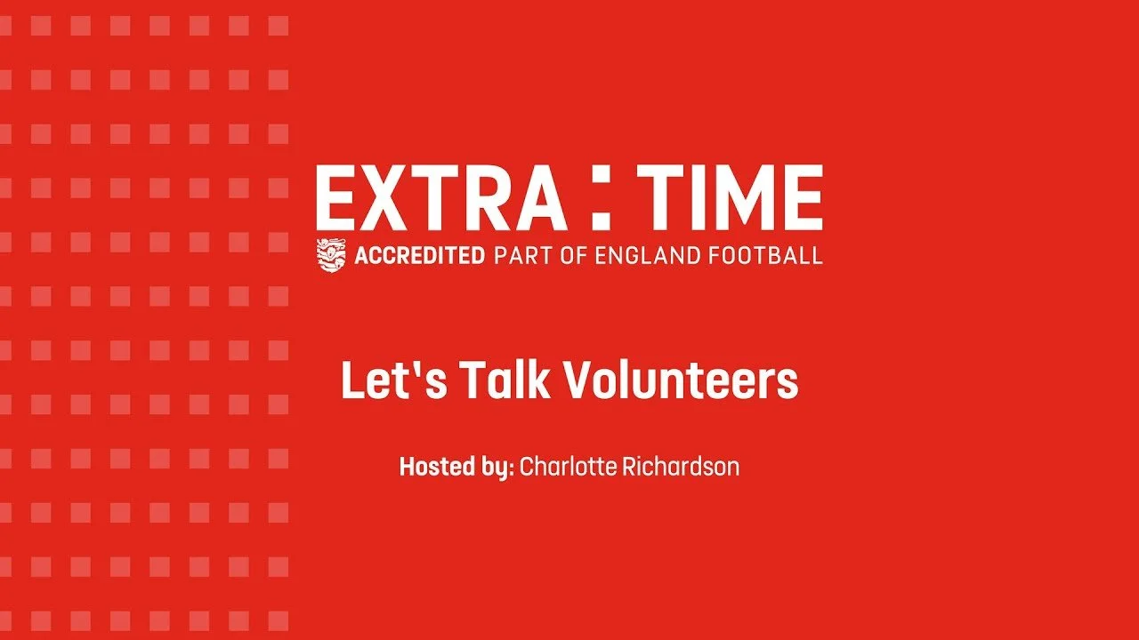
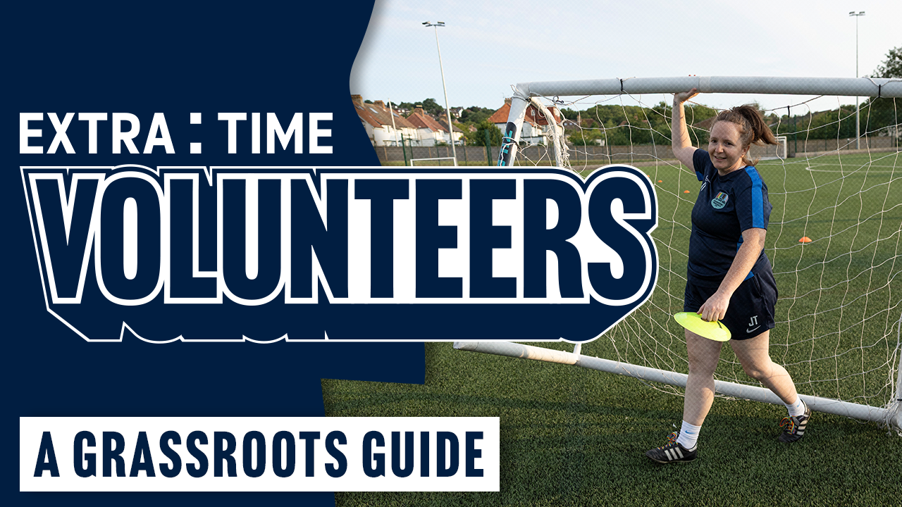
Despite housing incredibly valuable and engaging content, Club Hub’s “EXRA:TIME” series didn’t get much reach in big part due to how it was presented. There was no imagery of the hosts, guests or topic at hand, no intriguing language and as far as YouTube thumbnails go - it was unfortunately too plain to stand out against its competitors. The revised design addresses these points and helps the content appear more engaging while maintaining an air of professionalism, as at its core, the content is primarily an educational tool housed under the FA roof. The use of the FA Blue also helps set it aside from its sister series “In The Box”.
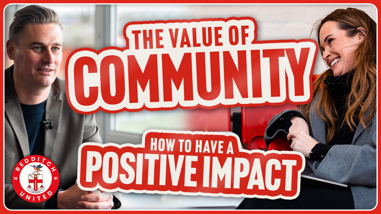
In The Box Thumbnail Redesign
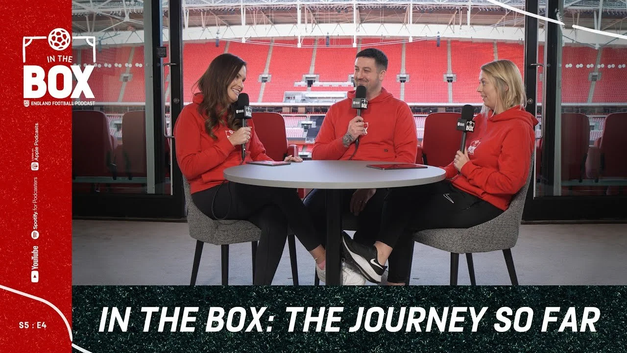
“In The Box” is a snappier, more entertainment-heavy series geared towards highlighting specific clubs and ways your club can improve. The old design had too many unnecessary and illegible elements, such as featuring the YouTube logo in the YouTube thumbnail or repeating the title verbatim. The new designs are much more focused, cutting through the noise by only including elements that are strictly necessary. Club logos are featured prominently but not as the main focus as their name will always be mentioned in the title, the photography now highlights specific members of interest with sharper colour grading and the text is easily parsed by grassroots volunteers when looking through the channel for content specific to their needs. This went hand-in-hand with a social strategy plan the Get In agency and I worked on to revitalize the way the Club Hub presents itself online.
Logo Redesigns
When tasked with redesigning a logo that had been present on the channel since its inception I knew I wanted to retain some legacy elements as to not alienate long-term viewers - the content itself wasn’t being completely overhauled, just refreshed to appeal to a wider audience, which is something I wanted to make clear in the logo design. One of the Club Hub’s main concerns was that all three of the old logo designs felt quite disconnected, which is something I was able to rectify by unifying their design principles. This was done by using uniform design elements throughout all three logos such as the same fonts, typesetting and hierarchy, but most importantly by using the corner arc present in the original In The Box logo as a consistent design element throughout all three logos. This would then be evolved as a key part in the motion design for multiple series’.
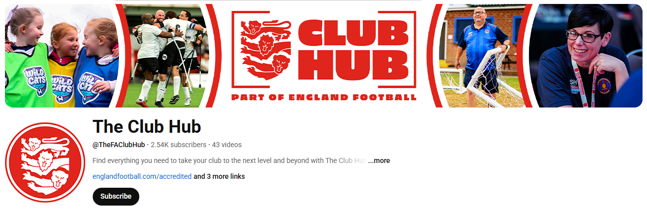
YouTube Branding Redesign
The Club Hub’s old YouTube branding had the same troubles as many of their old thumbnails, containing too much unnecessary information and not enough eye-catching imagery. As the channel is heavily geared towards grassroots, highlighting volunteers and the unsung heroes of the football scene, it only made sense to showcase this as soon as you land on the channel itself to immediately communicate to viewers what and who the channel is about.